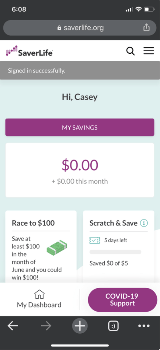
Before
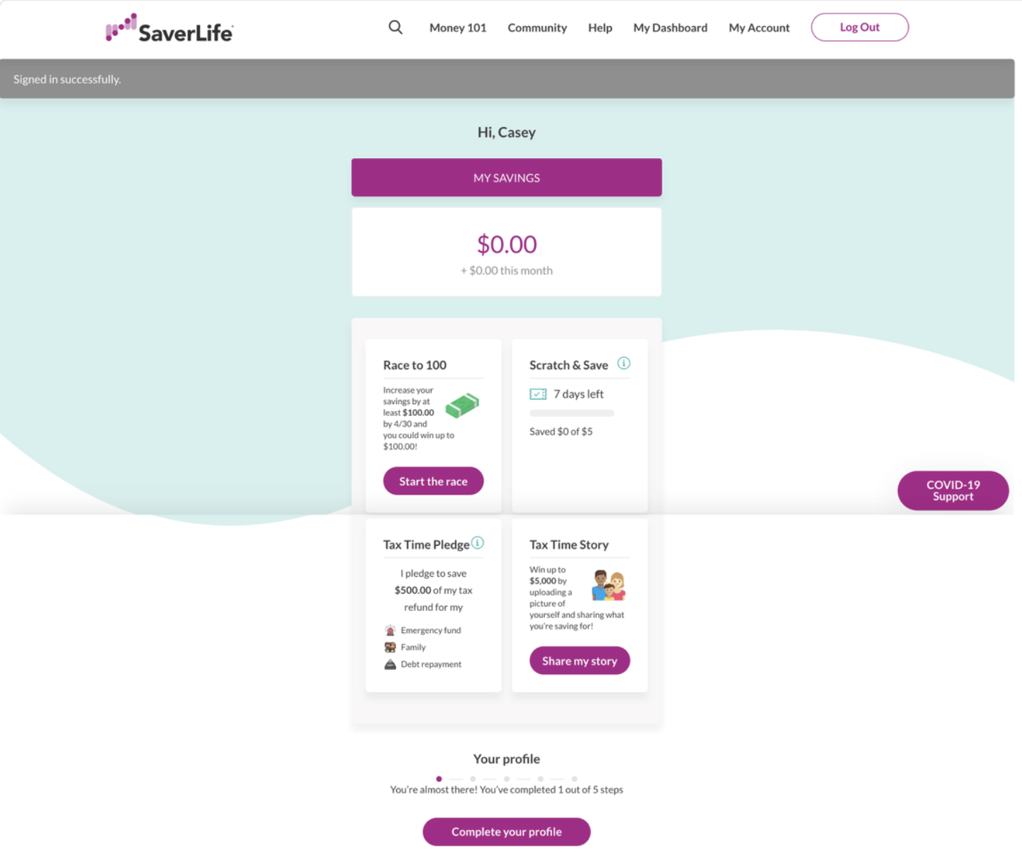
Scattered Features, No Habit Formed
What members experienced:
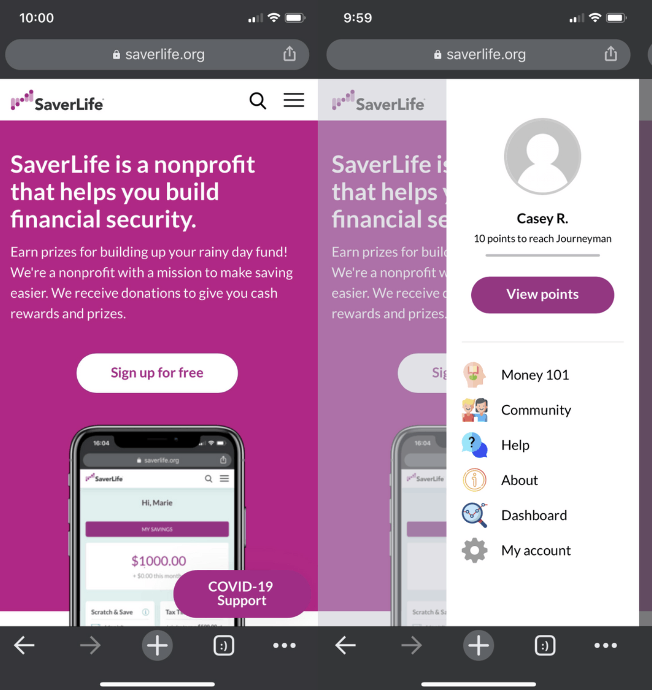
- Members saw SaverLife as a "lottery" not a savings tool
- Dashboard only showed sweepstakes challenges
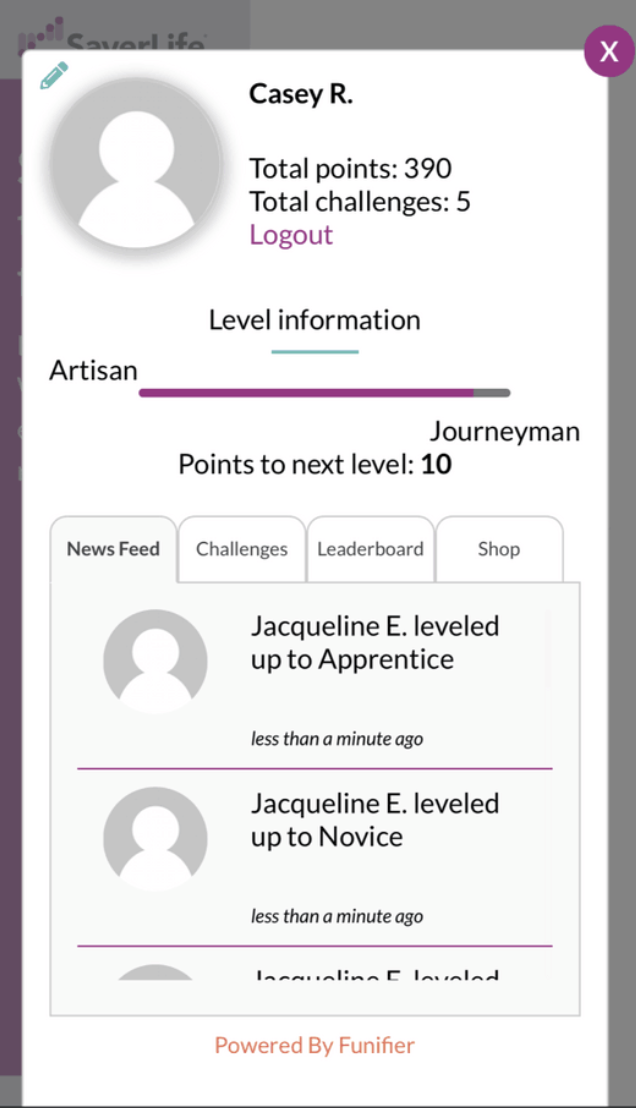
- Majority of users never discovered the points system
- Gamification features hidden in hamburger menu
- No clear connection between actions and savings progress

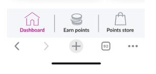
User flow
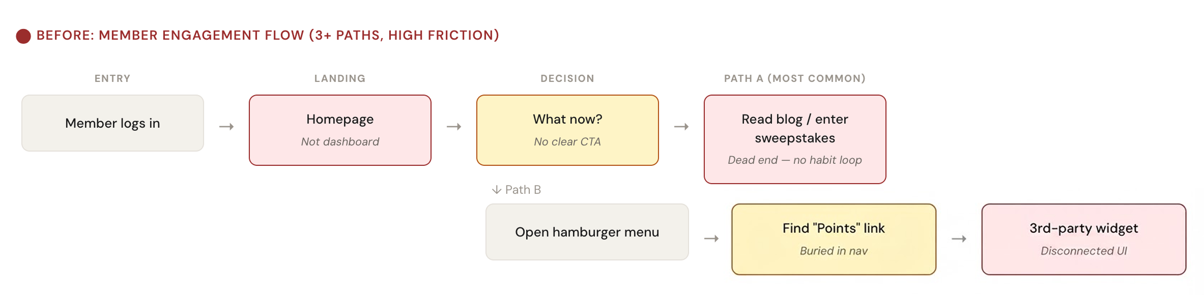
RETENTION PATTERN
Engagement spiked during sweepstakes promotions, but remained flat retention between events. This meant there was no habit formation loop.
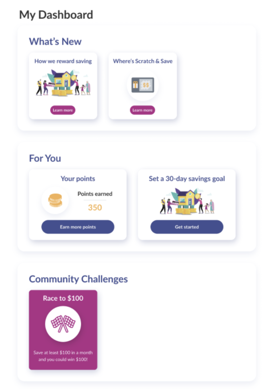
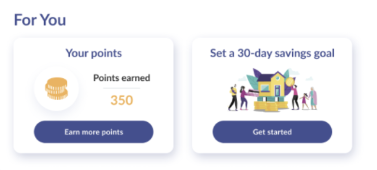
After
Cultivating a Desire to Save
What we changed:
- Improved navigation and visuals of the dashboard
- Better highlighted core features
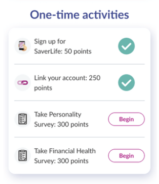
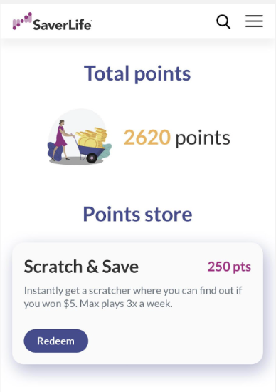
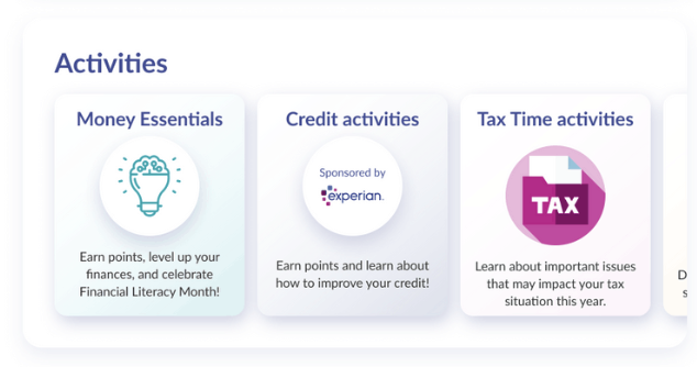
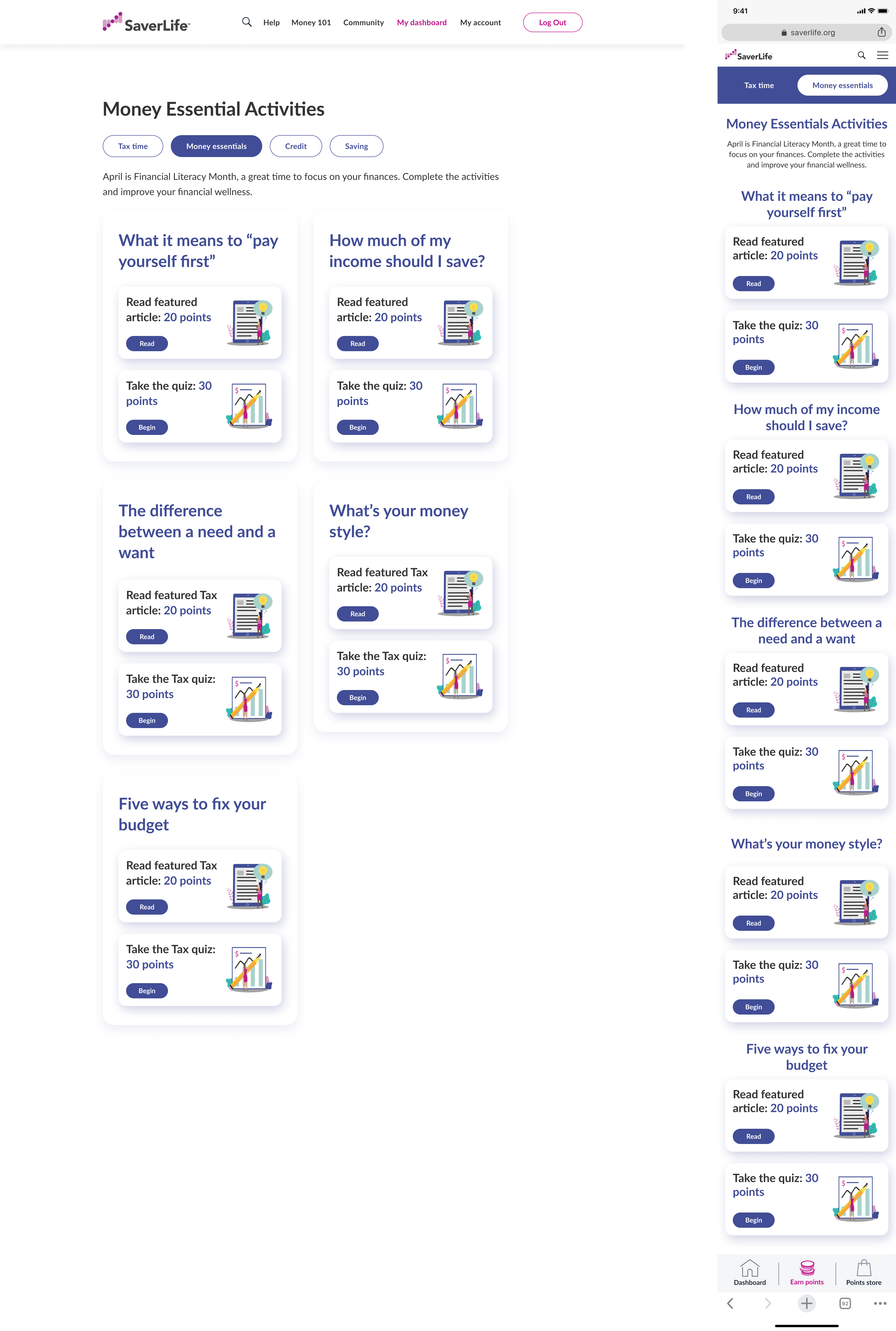
- Introduced points store and point activities
- Leveraged gamification to form habits = Created weekly engagement loops
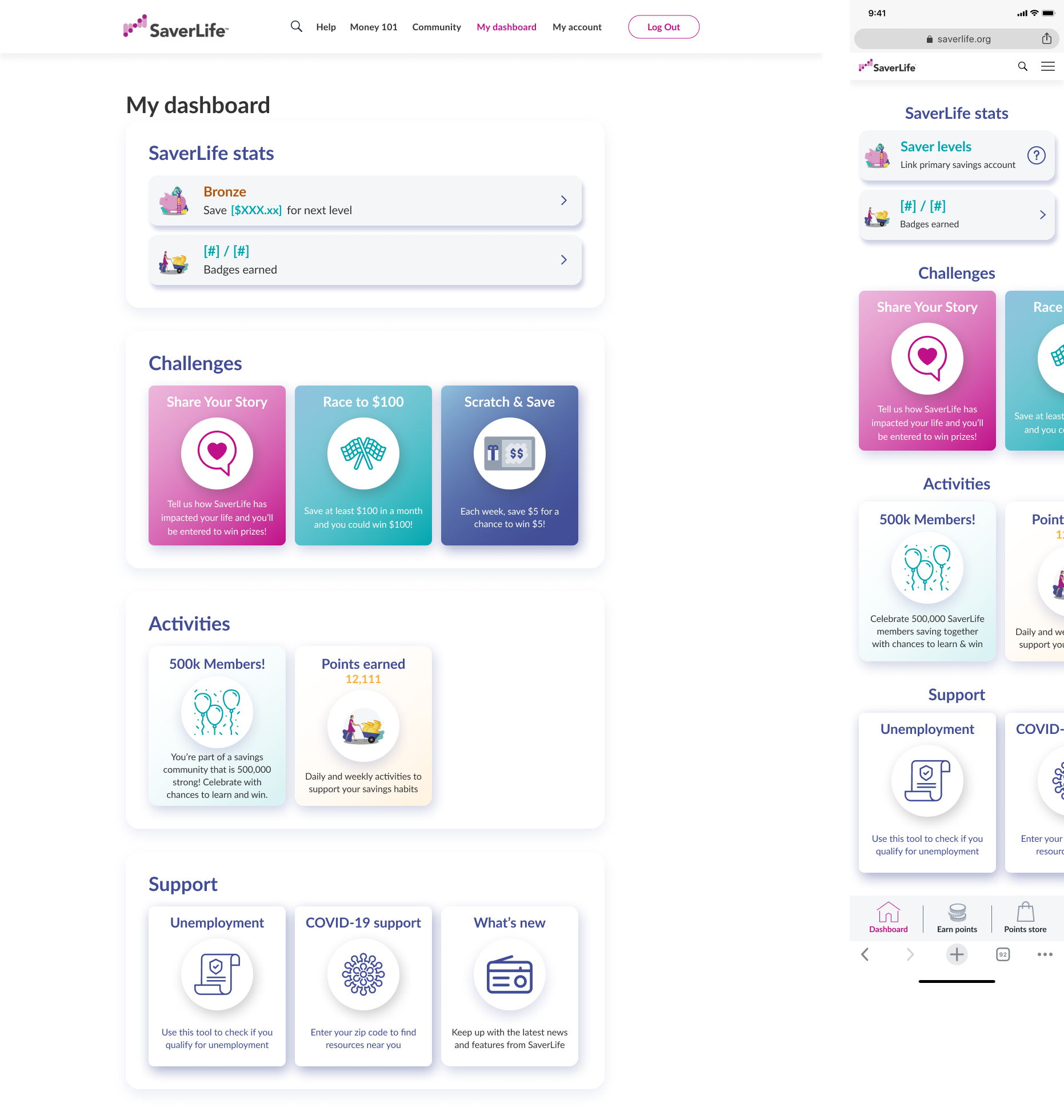

User flow
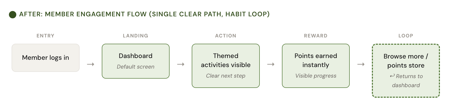
KEY OUTCOME
2x Retention YOY and 2.5x weekly active users
This meant we established savings habits for a larger number of members than ever before.
This meant we established savings habits for a larger number of members than ever before.