How might we reduce barriers preventing trial users from converting?

Crafting a new payment conversion experience that increased deposits for a $60M ecommerce platform by almost 10% on their mobile app platform.

OVERVIEW

Context
  • My role: Senior Product Designer
  • Timeline: 3 months (concept to release)
  • Platform: Mobile App, Responsive web
Company
Ingenio is a $60M+ per year ecommerce marketplace that has supported customers wanting to connect with spiritual and wellness advisors over online chat or phone via pay-per-minute model.
Problem
Despite online chat being the predominant way new customers preferred to speak with an Advisor on Keen, (Ingenio's flagship marketplace), there was a 58% drop off rate between trial-to-conversion across all platforms (responsive web/mobile app).

After facilitating several strategic meetings, I proposed a key component to that was how Keen asked users to spend more money after their initial trial was over.
Solution
I owned the end-to-end design process to better encourage users to pay out of their own pockets at the moment their trial period ended.

After running an A/B test, we saw that responsive web was not impacted by my final designs, yet those same designs resulted in a 9.5% increase in deposits on mobile app via optimizations and reducing cognitive load.

THE PROBLEM

Despite intro offers and chat offering low barriers of entry, Keen fumbled at asking new users to pay
No matter which channels new customers came from, chat was the preferred way they wanted to connect with a Keen Advisor for the first time. In fact, almost 80% of them primarily chose chat.

Despite the convenience that chat offered, Keen was losing customers across the new customer conversion funnel.

In short, that funnel encompassed: Advisor Selection > Registration > Adding payment method > First call/chat > Conversion.

If users made it through each of those steps, approximately 16% of all deposits came from the moment we asked users (who used chat) to pay out of their own pockets once their initial trial was over.

On mobile app however, there was almost a 30% negative difference between the amount of users who were adding funds on app vs. responsive web at that pivotal touch point.

Key issues that were negatively impacting conversions on mobile app were:
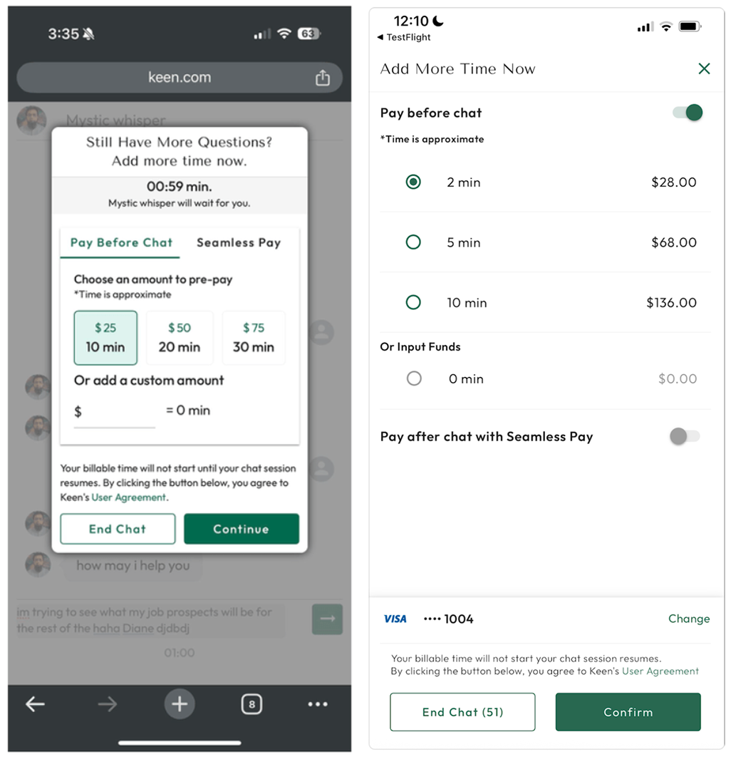
  1. Taking the user completely out of the chat experience once their initial trial period ended ("5 minutes for $1")
  2. Users only had 1 minute to navigate, read, and decide on which payment option they wanted to do, which often led to abandonment

RESULTS: BEFORE/AFTER

Less Friction, More Conversions: A 9.5% lift across our mobile app experience
After several iterations, design critiques, and dev handoff meetings, the final designs resulted in a 9.5% increase in deposits on mobile app primarily through strategic optimizations and reducing user cognitive load.

The key changes were:
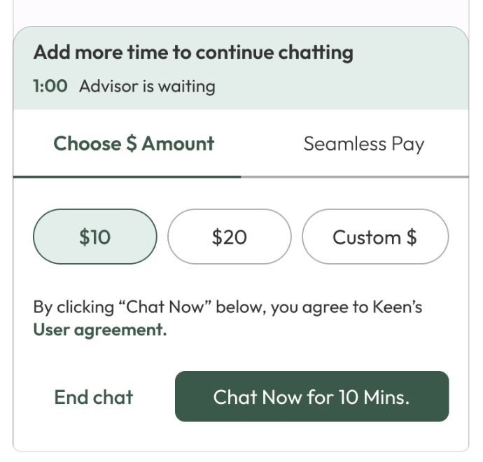
  1. Bottom-sheet integration: By leveraging this commonly used design pattern, we would not need to take users out of the chat experience on mobile app.
  2. Reduce cognitive load: By stripping away unnecessary details, and optimizing the UI, we would reduce the time it takes for users to make their choice before the time runs out.
BEFORE (Mobile app)
AFTER (Mobile App)

How did we get there?

RESEARCH INSIGHTS

Strategic funnel analysis revealed we should be targeting the "First Dollar Moment"
As mentioned earlier, I helped facilitate several calls in which we took a closer look at data that signaled issues facing our acquisition and activation funnels.

Those funnel steps included:
  1. Advisor selection
  2. Registration
  3. Adding a payment method
  4. First chat/call
  5. Conversion
These discussions revealed three key strategic areas to address:
  1. Visit > Reg: Which encompasses where unregistered users explored and selected an advisor to connect with
  2. Reg > FBM: Which encompasses the moment users first created an account to the moment they first pay out of pocket (FBM = "first billed minute" = first paid conversion)
  3. FBM > Activation: Which encompasses everything that happens between their first paid connection to their next paid connections
Each of these core areas had significant drop off rates and posed other challenges that ranged in scope.

In order to navigate this, I worked in close collaboration with my PM and product leadership to look for "quick/impactful wins" to address moments that directly impacted revenue.

This is why I advocated for prioritizing how we ask users to spend their first dollar with us at the moment their trial period ended, aka when their first chat ended and/or when the intro offer ("5 minutes for $1) was all used up.

THE OPPORTUNITY

Design for Decision: Create Clarity Under Time Pressure
Upon further discussion, we recognized changes to this key moment could (and should) be tested everywhere to all users via an A/B test.

Therefore, by addressing this touch point via targeted optimizations, we could:
  1. Help increase the rate in which new users added funds to make their first paid transaction
  2. Potentially improve all FBM-related conversion rates
  3. Potentially increase ARPU for existing users

PROCESS

Generating impact under constraints became achievable by focusing on reducing cognitive load via targeted optimizations
CURRENT STATE:
As I first began to explore changes across mobile app and responsive web, I reviewed the current state and presented these main issues:
  1. We crammed too much detail within the current designs
  2. We were not leveraging modern UI design patterns
  3. We did not make it clear to users they were still in the chat (applied to mobile app only)
However, I had to be mindful of which changes to pursue so it would not introduce too many variables into the A/B test so I had the following constraints:
  1. I could not change the amount of time users had to make a choice (1 minute)
  2. I could not change the # of options (we later settled on 2 "price bucket" options, 1 for custom amount, and 1 for "seamless pay")
  3. We would not change any backend logic that determined how expensive or inexpensive some "price bucket" options could be, or the min/max custom amounts users could input
ITERATIONS:
Now that our goals and approach were set, I established this main design approach:

How might we reduce the cognitive load on the user by streamlining the UI and other details so customers can make their choice with confidence before the time runs out?

This helped me navigate/resolve the following considerations & iterations:

FINAL DESIGNS
As I reviewed these iterations across several meetings, the product team and other stakeholders offered the following key feedback that contributed to making the final designs:
  1. Bottom sheet design pattern was applicable to all mobile platforms so we should leverage it
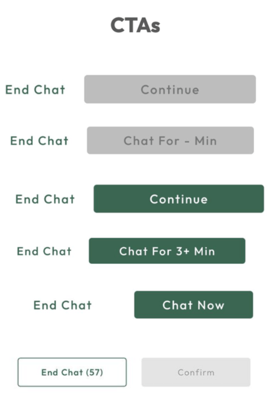
  2. CTA button sizes varied but could encourage more conversions
  3. They preferred to not stack the options on top of each other since it could appear as if it was "too much to read"
  4. The chip buttons should be easier to select and be more evenly distributed across the layout
  5. We should not give new users in particular the option to change their payment method at this moment (especially if they only have 1 minute to decide)
  6. We should not show "seamless pay" option for new users as it was prone to be misunderstood
  7. The disclaimer copy had to remain for all use cases
RESULTS
As mentioned earlier, we ran an A/B test across all platforms and although mobile app saw a 9.5% increase in deposits, responsive web platforms remained unaffected.

During retrospectives, it was determined that responsive web experiences more "noncommittal users" than mobile app because new users come in through different marketing channels. However, when you download an app, you're more likely to at least engage with it which was especially true for Keen since it's a niche marketplace.

VALIDATIONS

Placeholder
Placeholder

Placeholder:
  1. Placeholder
  2. Placeholder
  3. Placeholder

PROTOTYPES

Reducing Friction to Drive Time-Sensitive Conversions
By having a more streamlined and mobile friendly design, we could encourage more first time users to make a choice before the time ran out instead of wasting time trying to navigate, or understand their options. The GIF below represents the new designs (note loops slowly):

REFLECTION

What This Revenue-Generating Initiative Taught Me About Exemplifying Strategic UX Leadership
Given the scope and impact of this initiative, I knew from the beginning I needed to clearly articulate how I was approaching these designs and how that trickled into each design detail.

In practice, that meant being clear at the start of (almost) every interaction with stakeholders and the product/eng. teams what the goals were, what the current state looked like, the constraints we had, and what feedback I needed. It took several meetings to get alignment on several design choices like choice of layout, interaction states, etc., but I made sure to listen, and follow up with meeting summaries/next steps in order to hit the release date.

Even though this sounds like a standard way of working, I've encountered many times where other designers, or other team members did not prep, or follow up enough to ensure a quality outcome to maintain momentum. To me, being a designer in a senior/leadership position entails everything that comes up being a great designer, but also, being a great professional too.

Strategic communication and thorough preparation enabled me to navigate feedback and scope changes while maintaining quality and hitting deadlines. For instance, when the project unexpectedly expanded from new users to all users, my detailed design rationale and clear stakeholder alignment process allowed for quick adaptation that did not derail the timeline and still provided meaningful impact to the business.